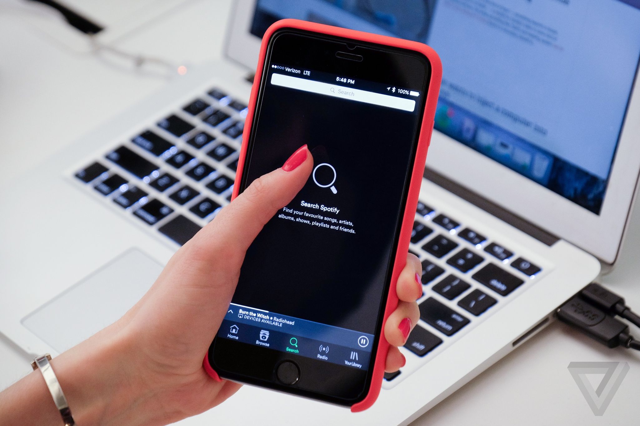
Spotify Finally Suits iOS With Its Latest Update
Spotify have updated the design of their app on iOS bringing it in line with the appearance of Apple’s mobile operating software.
In a move sure to meet the applaud of many, Spotify have removed the hamburger menu from their iOS app. The much criticised menu design has been replaced in favour of a navigation bar running across the bottom of the screen, familiar from many apps on the Apple App Store.
With this update you will be able to access the 5 buttons at the bottom of the screen at anytime, without having to open an extra menu. From left to right the navbar features: Home, Browse, Search, Radio and Your Library buttons. The bar sits under the Now Playing bar when minimised and leaves the rest of the screen for browsing.
This change doesn’t apply to Spotify’s Android app, however Android has been a far bigger adopter of the three-lined hamburger menu, whereas Apple has always been a navbar type of OS. Even Android seem to be moving away from the menu now, in March Google told app developers to use navigation bars instead of hamburger buttons.

The update is being rolled out today to those in the US, UK, Germany, Austria, and Sweden. There’s no specific date for other countries but they say the new design will come elsewhere in the “coming months”.
