Redditor Reveals YouTube’s New ‘Material Design’ Look
Google’s ‘Material Design’ look applies to many of their apps and programs and it seems that YouTube is getting an update to bring it in line with their design.
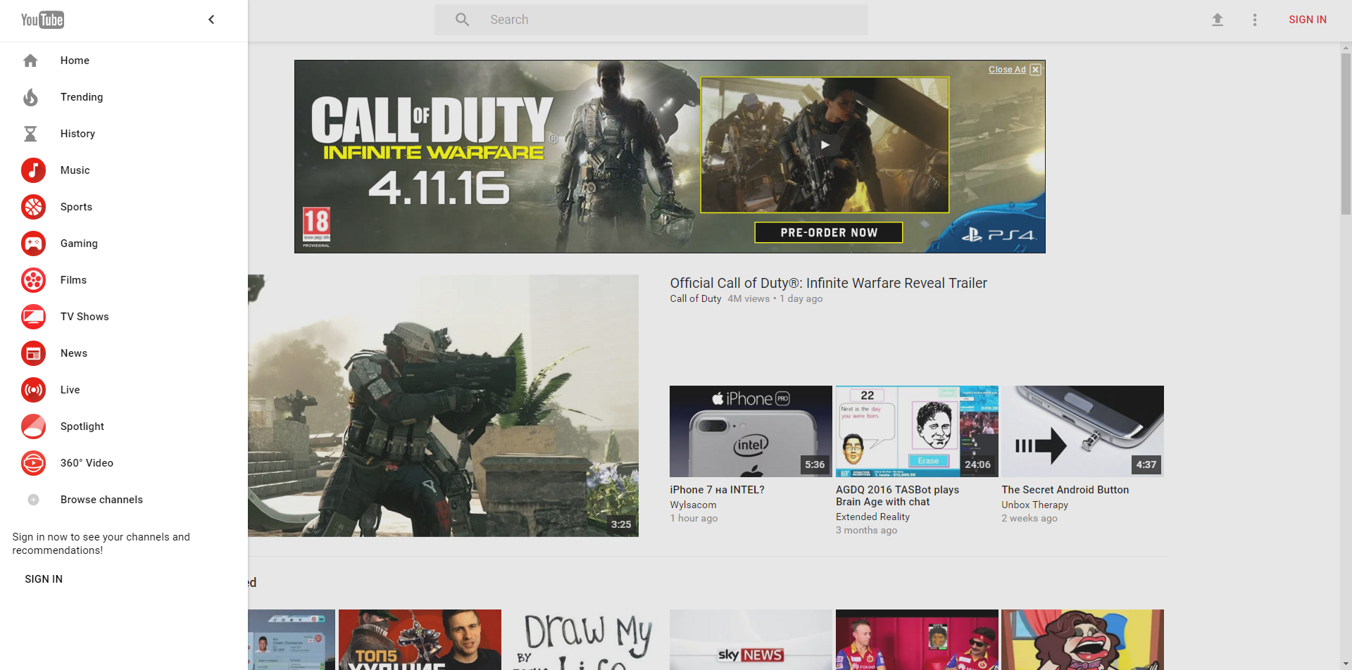
Google’s Material Design is easily identified by it’s use of bold, block colours and simplistic, straight lined designs. Now a Reddit user has discovered that Google are testing this design with YouTube, and has even found a way that you can view the new design.
To access the new look for YouTube you will have to be signed out or using incognito mode. Here’s a step-by-step guide to view the websites potential new design:
- Go to https:www.youtube.com/?gl=us
- Open the developer tools (ctrl + shift + i)
- Go to the ‘Resources’ tab and delete the VISITOR_INFO1_LIVE cookie under the YouTube domain
- Go to Console and define the VISITOR_INFO1_LIVE cookie using the following command: document.cookie=”VISITOR_INFO1_LIVE=Qa1hUZu3gtk;path=/;domain=.youtube.com”;
- Reload the page
Credit goes to Reddit user ‘giorgiomarinel’ for discovering this method.
The new look doesn’t take a drastic direction, in fact you might not even notice the change if you don’t compare them side-by-side, or if you don’t use YouTube a lot. It does look neater though and could imply further changes to come. Changes at the moment seem mostly focuses on aesthetic rather than any functionality differences, the video player for example is still exactly the same.
It’s not clear when or if this design will officially be introduced to YouTube but when it is you can be sure to hear about it here at the RouteNote Blog.