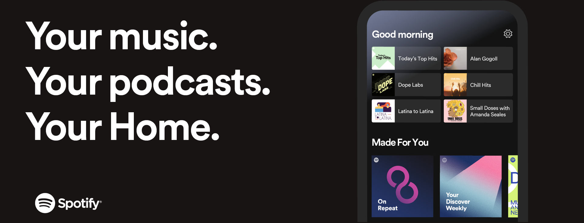
Check out Spotify’s brand new Home screen page
Spotify listeners will get something new when they open the app and listen to music with a better home page that caters to them.
Spotify have updated their Home screens for mobile and tablet listeners. Spotify’s goal is to make it easier than ever before to dive right back into the music you love or discover something new to stan on. The new home page is a full refresh with more personal curation and contextual
So whether you’ve discovered a new podcast, have been listening to an artist a lot lately, or have an album you played last time you were on the app it will be presented to you so you can jump straight back into listening. There will be a whole space at the top of the new home page dedicated to making access to familiar music and podcasts easy.
The rest of the screen the will adjust constantly so that it follows you through the day and has you covered with recommendations and options for the morning, afternoon and evening. When you open it up first thing Spotify will say “Good Morning” and present you the content they think suits the morning. Likewise throughout the day Spotify will tailor its home page to what’s happening.
Beneath these personal and contextual offerings users will find their top podcasts, ‘made for you’ playlists, recommendations for new discoveries based on your listening, and more. The whole page has been re-designed to present you with music and content based entirely around your taste and what you’re up to.
Spotify’s new home page is rolling out to mobile and tablet apps now.
