YouTube iOS App Redesign Brings Upload Editing Tools
Yesterday YouTube updated their iOS app, bringing to it the new YouTube mobile design.
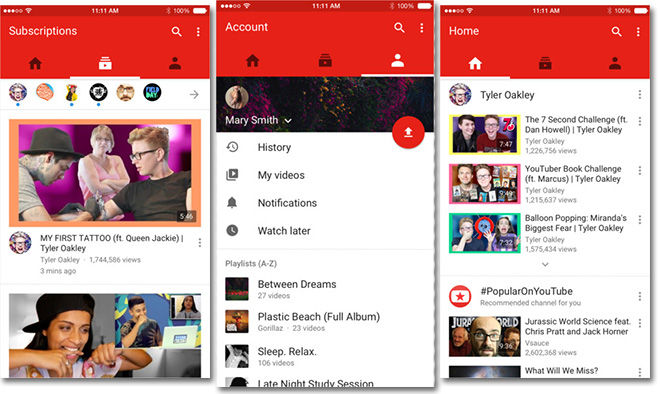
The new look YouTube mobile app, introduced to Android earlier this year, features three columns at the top. These three columns, entirely replacing the sidebar “hamburger” menu, from left to right are:
YouTube Homepage: Where you can see recommended videos and channels, what’s popular, watch again etc.
Subscriptions: A feed of uploads from your subscribed channels. The channels you’ve subscribed to will appear near the top in small circles.
Account: Here you can access your history, my videos, notifications, watch later and playlists.
The new app also features Google’s new material design aesthetic, using bold colours with a simplistic appearance. Another introduction is ‘swipe’ gesture controls allowing you to move between menus with the swipe of a finger.
A note with the update said:
The redesigned YouTube app makes it easier to find what you love. Now your recommended videos, favourite channels, and subscriptions can be accessed by tapping each icon or swiping your screen. You can also create fun videos on the fly with the new in-app editing tools.
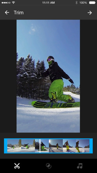
Possibly the most exciting new tool however is YouTube’s new video editing tools that are included in-app. Users will have access to these new tools when they upload a video directly to the app.

With the new editing tools you can cut and trim videos, add visual filters and also add a soundtrack.
The update should now be available to all iOS users for the free YouTube app.
Check out the new YouTube hotness, now on the latest version of our iOS app! pic.twitter.com/d3nfsZKjCA
— YouTube (@YouTube) October 6, 2015
