Spotify testing new mobile app with unrestricted playlists
Spotify are experimenting with a pretty drastically different interface for their mobile app which will make some big changes for free users.
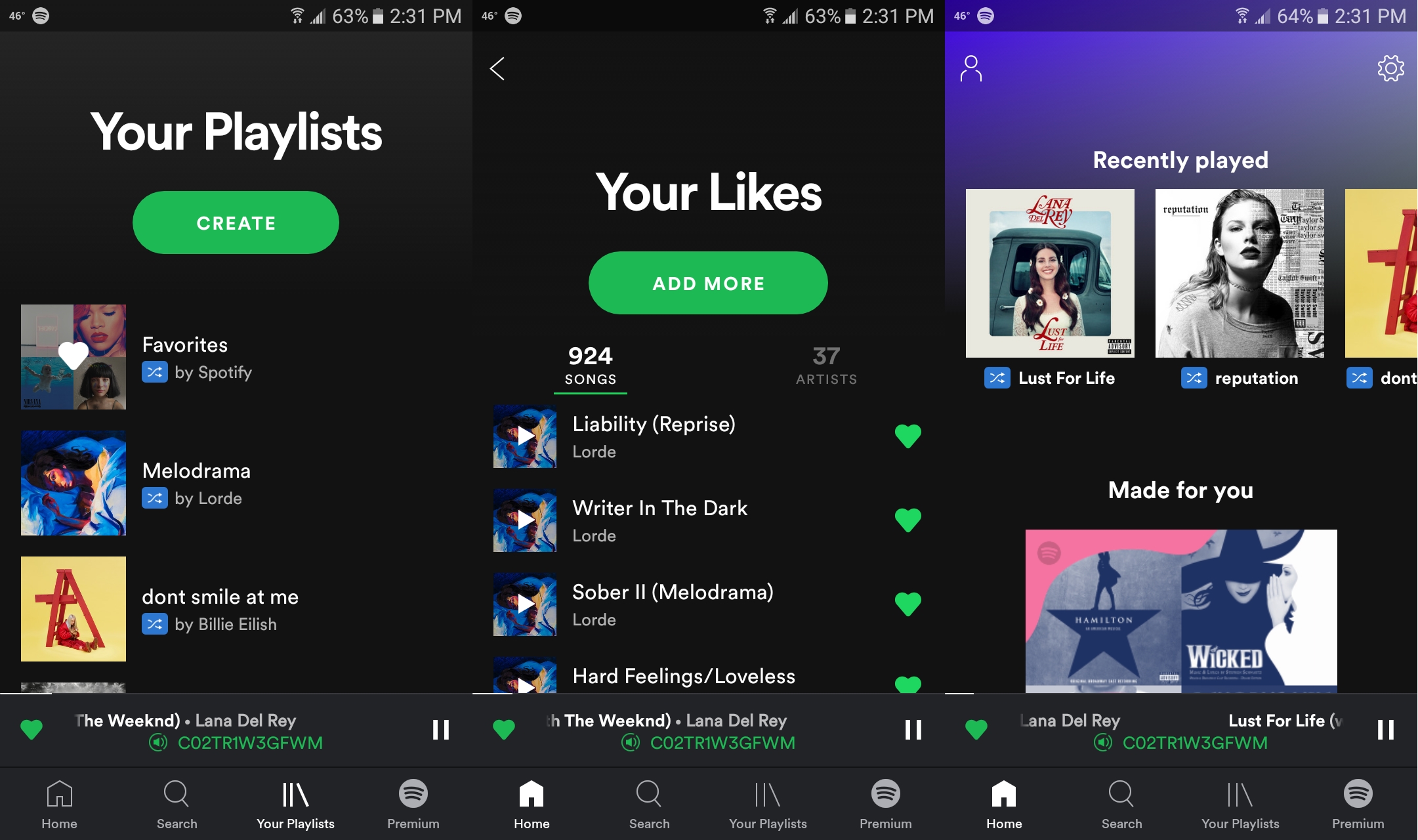
Certain users have noted changes to their Spotify mobile apps recently with a new design promoting Spotify’s curated playlists over personal libraries. But another change the update has introduced allows free users to select and stream at will from certain playlists.
Spotify free users have never been able to select track by track what they want to listen to on mobile devices before, having to instead shuffle through albums, artists, playlists or related tracks. But their new app-in-testing does away with that for a bunch of Spotify’s own branded playlists, allowing users to freely browse and play music in them.
Of the select users who have received the update for testing not all of them are happy with the changes though. When the change was noted on Spotify’s Community forum, one user wrote:
I have quite a few gripes about the new UI but I will tell you what I like before I get into the issues. I really like that album artwork fills the screen when playing a song. I also like 30 second preview. Its an excellent feature. I appreciate also that you can sample songs in the playlists to like or dislike. It saves skips but it doesn’t help as much in a 100 song playlist. My preference is to just start the music, let it play and keep my hands off the phone. The less clicking the better. Which brings me to my issue with the new UI.
I find this new version harder to navigate. I have over 2700 songs, 30+ playlists and 75 liked artists. All of these things are now mashed together and I cant sort through them. I can’t search within the library by artist, album or playlist. Its just all jumbled together and I have to scroll through hundreds of playlists.
The home screen prioritizes recently played and playlists that I don’t follow. I preferred when the home screen had Discover weekly and artists/songs you might like. I like it to show a record of things I’m listening too and not just random suggestions of playlists.
What happened to radio? I don’t even see that feature and I used it a lot.
The premium ad is above the content I’m looking at and I have to constantly scroll down to just hit shuffle. Its not user friendly.
I really don’t like that songs are no longer listed vertically but centered in a paragraph format. People are used to list formats. Its cleaner and concise.
The update is just really messy to me. Please fix these things. I really like Spotify but this just really takes the simplicity and fun out of playing music. Thanks
When contacted by Music Ally, Spotify said: “At Spotify, we routinely conduct a number of tests in an effort to improve our user experience. Some of those tests end up paving the path for our broader user experience and others serve only as an important learning. We aren’t going to comment on specific tests.”
So these changes may not end up coming to everyone but Spotify have been pushing Premium more and more in recent years after criticism that their free service undercut artists. This change promotes the seamless experience of Premium with a taster as to what it’s like without completely redesigning the service.
