Tidal unveil a much-needed update, enhancing music discovery and exploration
Tidal’s mobile app has been given the 2.0 lick of paint bringing it up to date with competitors and making music streaming with Tidal a pleasure.
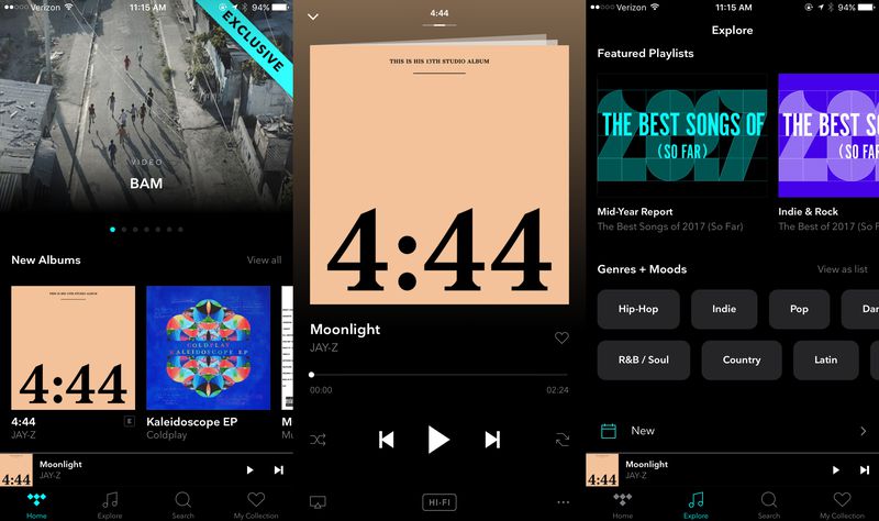
A much-needed update has come to the mobile app for Jay-Z’s music streaming service, Tidal. Focusing on its visual layout, the update streamlines exploration of the app and makes it easier than ever before to find the latest and greatest music.
The first thing you’ll notice when you open up the app is the new look for the homepage which ditches its limited display of new and top music, now offering a variety of different genres and music. Next you’ll notice how much better the menu looks, with a row of icons at the bottom of the screen replacing the hamburger menu from before. This brings it much more in line with other modern music apps like Apple Music and Spotify; Tidal’s biggest rivals.
The Explore section of the app has gotten a new ‘Genres + Moods’ segment where you can explore music based on how you feel or explore specific genres. The Explore section also now features a suggested artist and album section for recommended music based on your tastes.
When you are playing music you can now simply swipe between the queue and song suggestions from the Now Playing screen rather than having to go through menus. Overall Tidal’s 2.0 mobile app makes the whole experience flow much easier with a new arrangement that makes finding your favourite music and discovering new music better than ever.
Tidal 2.0 is available via update now from the Google Play Store and Apple App Store.
