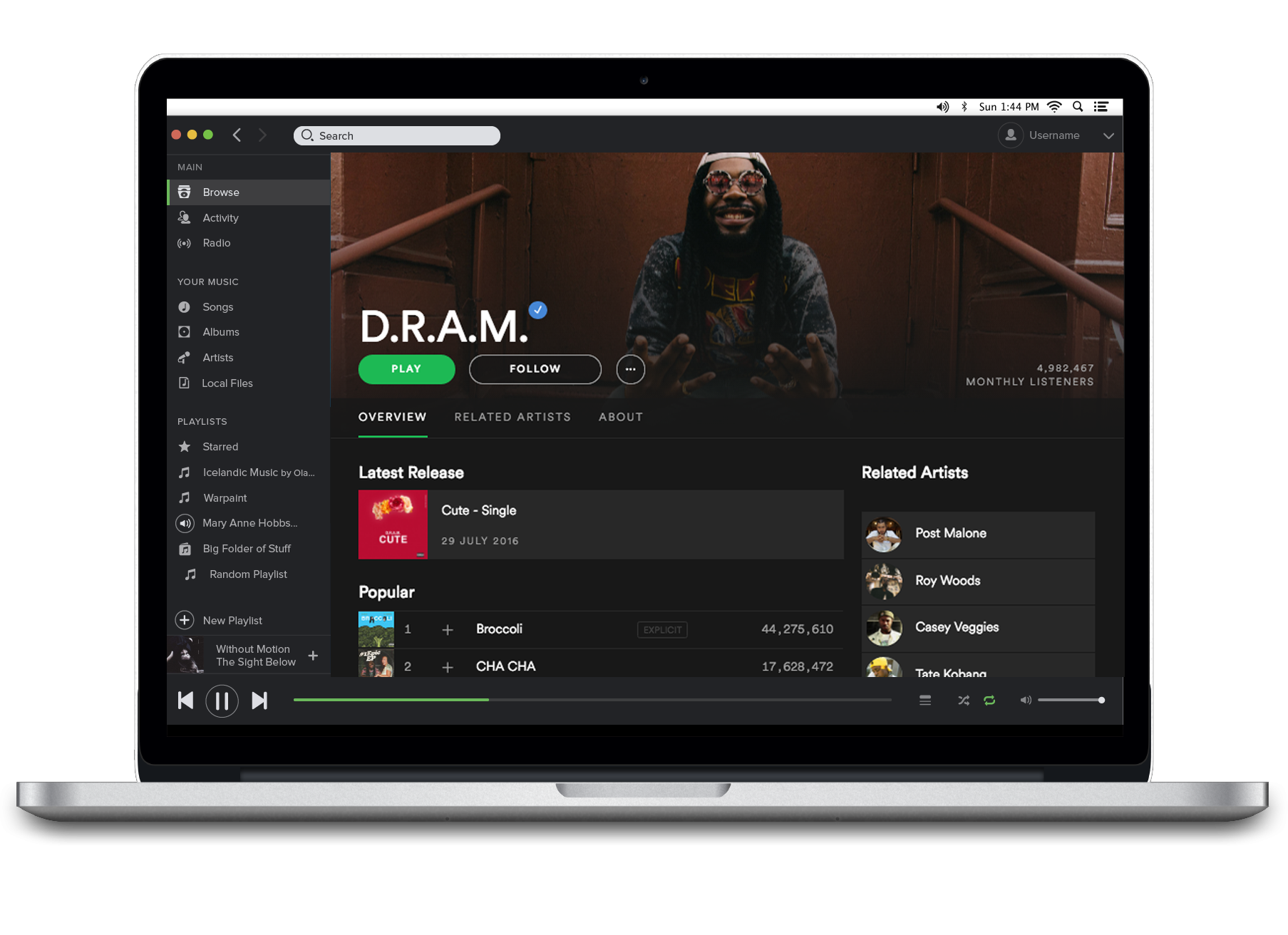
Spotify’s new design layout for artist profiles aims to emphasise images
Shortly after Spotify made it so that artists can easily update their artist profile images Spotify have updated their artist profiles to emphasise images.
Spotify have updated their layout for artist profiles on their music streaming service. Instead of having a profile image and a separate header image on the artist’s profile page there will now just be one image, the header. This comes just a week after Spotify made it easy for artists to change their images within the Spotify desktop app.
Spotify have made this change to streamline the appearance of artists’ pages across Spotify and to put more emphasis on the full image, allowing artists to define themselves with one image. It makes sense as, before users could change their pictures themselves, many artists only featured one image regardless leaving a giant blank space.
To make sure that they don’t just transfer your original profile image into your header, which could result in stretching or distorting due to the larger space to fill, Spotify are leaving profiles without header images until they update their photo. So whilst the transition is taking place you may see some artists retain the small circular profile picture on their page.
Here’s Spotify’s full statement:
Today, we’re rolling out a simpler header design for artist pages in our desktop app. The new design gives more emphasis to your full artist image, while removing the secondary profile photo. Instead of managing two different photos, now you’ll have a consistent look that runs throughout all of Spotify.
If you want to update your image to optimize it for the new design, you do so from Spotify Fan Insights. Artists and managers without access can request it here. Other members of an artist’s team can also submit a new image using this form.
