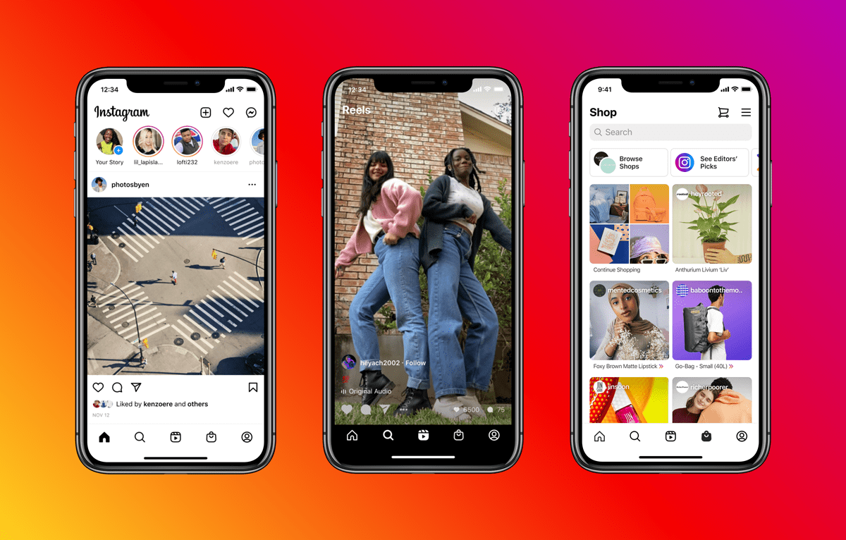
Instagram’s redesign gives quick access to Reels and Shop
One of the biggest redesigns to Instagram since its launch puts Reels and Shop tabs in the footer, in place of New post and Activity tabs.
Reels and Shop get their own dedicated tabs at the bottom, that can be quickly accessed throughout the app
From left to right, Instagram’s tabs are now:
- Home – the main Instagram feed
- Search – search for profiles/hashtags and a collection of pictures, video and Reels
- Reels
- Shop
- My profile – your feed, stories, bio, followers, IGTV, Reels and so on
Reels is Instagram’s TikTok clone. The whole interface is almost identical to TikTok’s, with an endless, algorithm-tailored, vertically swipeable feed of short-form videos. Instagram Reels launched in Brazil a year ago, with a full roll-out around six months ago. Hoping to steal TikTok users, Instagram feel the feature is ready to be placed front and centre.
Instagram’s Shop tab is a personalized list of merch. Featuring recommendations as well as an editor’s curated pick of items, be it t-shirts from influencers, albums from artists or shoes from a sneaker company. The feature was rolled-out earlier this year to specific brands and creators.
These tabs are in place of New post and Activity – showing new likes, followers and tags. Both of these screens can now be found in the upper right corner of the homescreen. New post can also be accessed by swiping to the right on the homescreen.
We don’t take these changes lightly – we haven’t updated Instagram’s home screen in a big way for quite a while. But how people create and enjoy culture has changed, and the biggest risk to Instagram is not that we change too fast, but that we don’t change and become irrelevant. We’re excited about the new design and believe it gives the app a much-needed refresh, while staying true to our core value of simplicity. We’ll continue listening to your feedback so we can keep improving Instagram for you.
Adam Mosseri, Head of Instagram
Many users have been frustrated by the change, however this is expected for any major social platform’s design change. Once the new locations of certain buttons becomes ingrained, it will be soon forgotten.
