Apple Music App Update Radio Tab For Beats 1
At last, the Apple Music app has gotten an update to improve its not-so-user-friendly design, for the Beats 1 tab at least.
Apple Music has proved a massive success since launching mid-2015, raking in 11 million subscribers in less than a year. Despite its achievements however many users still complain that Apple Music’s functionality and design, particularly on its mobile app, leave a lot to be desired. Whilst many praise the service, especially their flagship Beats 1 online radio, this shouldn’t be an issue for a multi-billion dollar company like Apple.
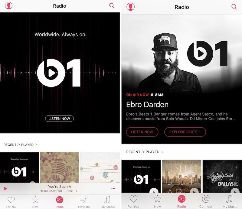
Thankfully Apple have recently updated Apple Music’s design for a better looking, easier user experience. The update only applies to the Beats 1 tab right now but signifies future improvements. With the update the bland Beats 1 “Listen Now” image has been replaced with a dynamic tab that shows the currently playing show/feature with details of the show and images.
With this update users can easily see what’s playing and decide whether they want to tune in to the 24/7, global station or listen to their own library, without having to open it to find out. The update also adds an “Explore Beats 1” button in the radio tab which lets users explore the timetable, upcoming hosts, interviews etc. Many Apple Music users didn’t even know the explore button existed before as it was hidden from the user interface.
Whilst a small update it is definitely a worthwhile one that improves the look and usability of Apple Music’s app. Hopefully this signifies more updates to come for an overall better experience with the new giant in music streaming.
