YouTube Music can’t leave the Now Playing screen alone
Some users are reporting seeing yet another rearrangement of the icons within the ‘Now Playing’ screen on the YouTube Music app.
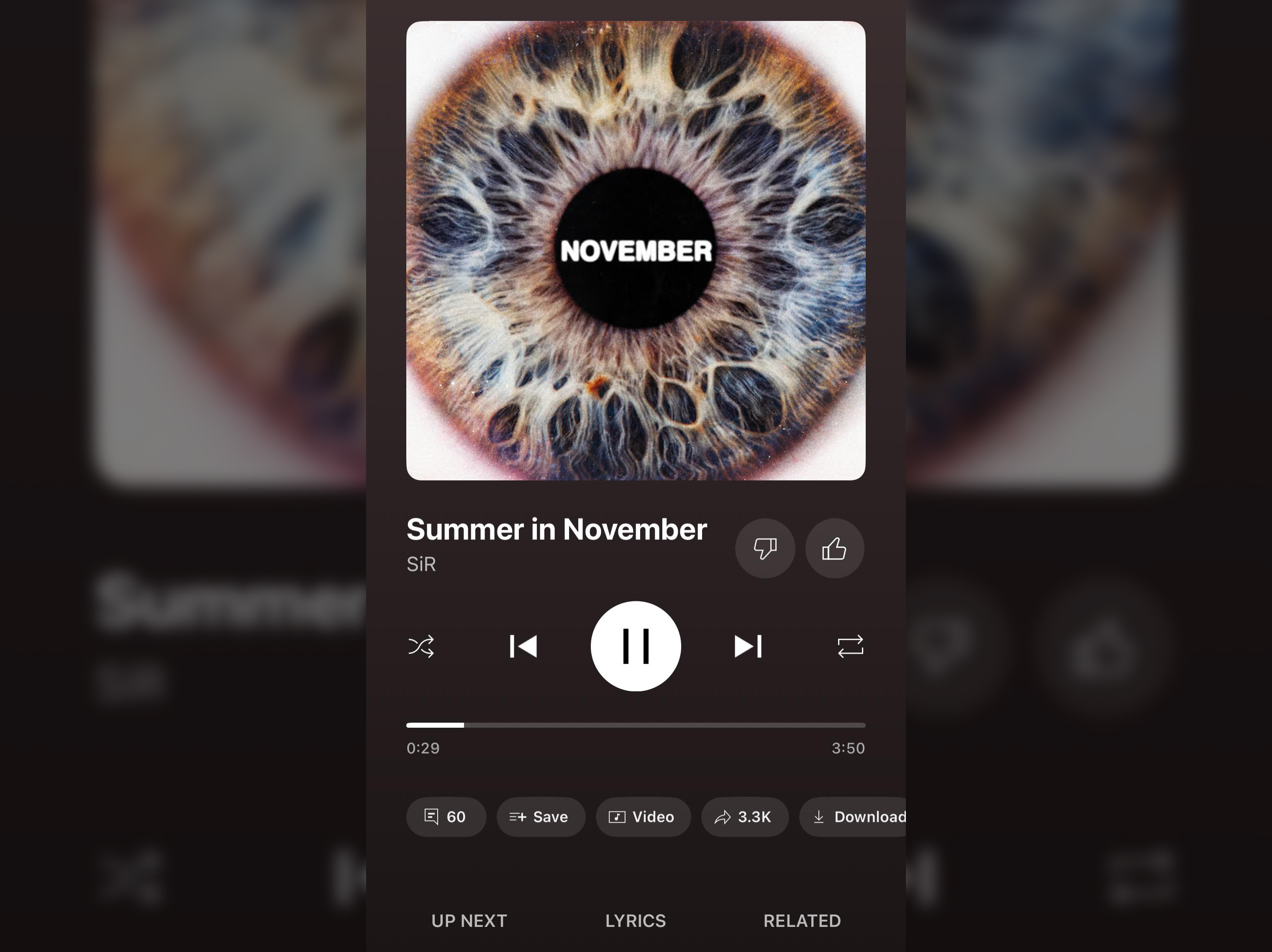
YouTube Music has been testing various placements for the icons on the Now Playing screen to a portion of users.
Based on the images from 9to5Google and Reddit, the placement change seems to move the large play, skip, shuffle and repeat buttons above the engagement buttons and play bar. The comments ‘Save’, ‘Share’, ‘Download’ and other engagement icons move down to the bottom of the screen, just above the ‘UP NEXT’, ‘LYRICS’ and ‘RELATED’ buttons. The ‘Song’/’Video’ switcher is becoming a toggle alongside the other engagement buttons. And in the latest change, the like and dislike buttons are moving up to alongside the track title, as in the image.
Most of Reddit seems to dislike the somewhat minor change, but it’s generally hard to find fans on board with app redesigns. Personally I’m still seeing the old version on my iPhone, so the features are still rolling out, if they ever do follow through with this latest test.
YouTube Music has also added a hidden feature in recent updates. You can now swipe left or right on a song in an album or playlist to ‘Play next’ or add it to a playlist.