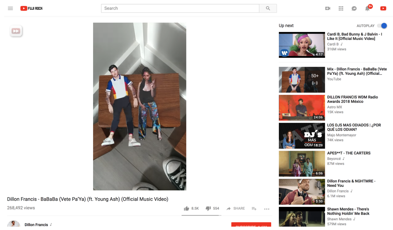
Vertical videos finally look good on YouTube
Bye-bye black bars. After years of discrimination YouTube are finally showing vertical videos the respect they (maybe) deserve on PCs.
Vertical videos on YouTube are finally going to look… better. Regardless of your opinion on whether vertical videos are sacrilege against viewing pleasure, YouTube are making the experience better by optimising vertical videos to fit your monitor rather than placing into the YouTube cube with black bars on either side.
Vertical videos now match the width of standard videos but extend below into the space where titles and descriptions are to allow it’s vertices to stretch out after years of fitting into the constrictions set by their wider brethren. This only works in Default View and not in the widescreen Theater Mode display, so the video will show in the left hand side of your tab with it’s new ratio.
Of course, this is nothing new for mobile viewers but smartphones have a vertical screen anyway so it’s always made sense. Rarely are monitors vertical, but this is an improvement that allows vertical videos more room to breathe even if they aren’t living up to their full potential. At the very least it gets rid of those annoying black bars which would taunt you with chants of “you’re watching a vertical video – you’re watching a vertical video.”

The new format will affect all videos in standard 16:9 format and vertical videos, as well as the 4:3 format videos of yesteryear’s. YouTube announced the update on Friday and users have had the weekend to get to grips with the new layout and they’ve expressed their feelings…
Whilst it is generally an improvement for videos that don’t fit into the standard 16:9 widescreen format users are complaining that it has actually made it worse for watching some videos. Users are reporting that in some cases the update makes videos even smaller than they would have been when squeezed into the widescreen box. In other cases the update has lowered the quality of videos or even cut sections of it off.
A user on the Google Forums, where they announced the update, was just unhappy that they couldn’t choose whether to use the new layout or stick with the old one. User Dermacrosis said: “It’s bloody awful give us the option to turn it off.” Another user comments: “Some YouTube videos just don’t look good when the screen is big. Either give us a way to opt out of this, or fix it.”
It’s likely Google are still working out the kinks and will update it based on the user-response so far. But then it’s YouTube, so maybe not and this is vertical viewing now until the end of time. We’ll have to wait and see, for now enjoy those extra inches!
