Vevo’s Update Looks Great and Personalises Your Music Video Experience
Vevo have overhauled their web design to look more like their mobile app, with a sleeker design and personalised recommendations.
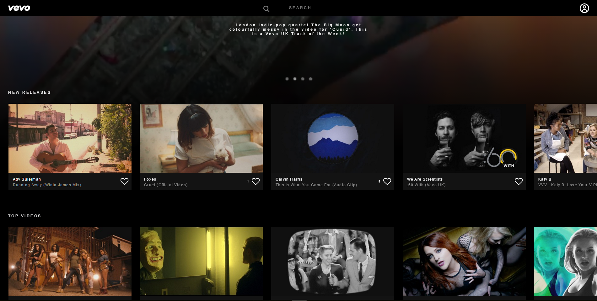
From today when you head to Vevo’s web page you’ll be greeted by a page familiar to those who use the mobile app. Their update refreshes their user interface with a design that looks better and makes exploring music videos easier than ever.
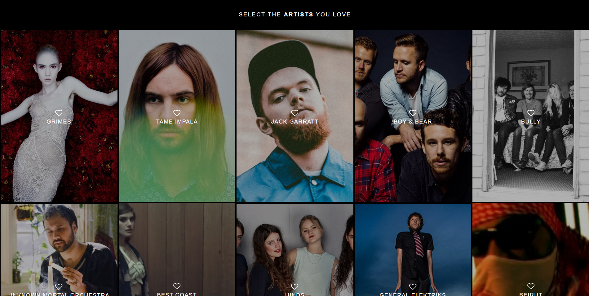
Vevo’s update doesn’t just splash a coat of paint over their design as they’re bringing curation to their website. On their mobile app when you get started Vevo will ask you to select your music tastes, allowing them to create recommendations and a personalised feed of music videos. Now you can do all this on your computer too!

But what if your tastes change after you first log in to Vevo? They’ve got you covered there too – as you watch and listen Vevo will use your history to update and improve it’s personalisation.
Also new is a larger video player, always nice, and a home page that shows it’s Spotlight feature, a feed where you can find the videos and playlists that Vevo recommends to you. You can also find new releases, top videos, genres, recently watched and featured playlists on the home page from today.
Last but not least, at least to some of you, Vevo have stopped Flash support. Vevo now use HTML5 to stream everything on their website.
