Spotify launches a refreshed experience for tablet devices
Spotify unveils a redesigned tablet experience for iPad and Android users, giving listeners more room to explore, discover, and stay engaged.
Spotify is redefining what it means to stream on a big screen. The streaming giant has introduced a redesigned interface built specifically for tablets, aiming to make browsing, discovery, and playback feel more natural on larger displays. Whether you’re listening from the sofa, the kitchen counter, or anywhere in between, Spotify wants the experience to feel seamless, and unmistakably Spotify.
It follows in the footsteps of Instagram who finally launched a native iPad experience last year after a 15-year wait. Now, Spotify is refreshing the tablet experience for iOS and Android devices. Tablets offer more screen space than phones, and Spotify’s redesign leans into that, opening up new ways to listen, discover, and stay engaged.
So, what’s new?
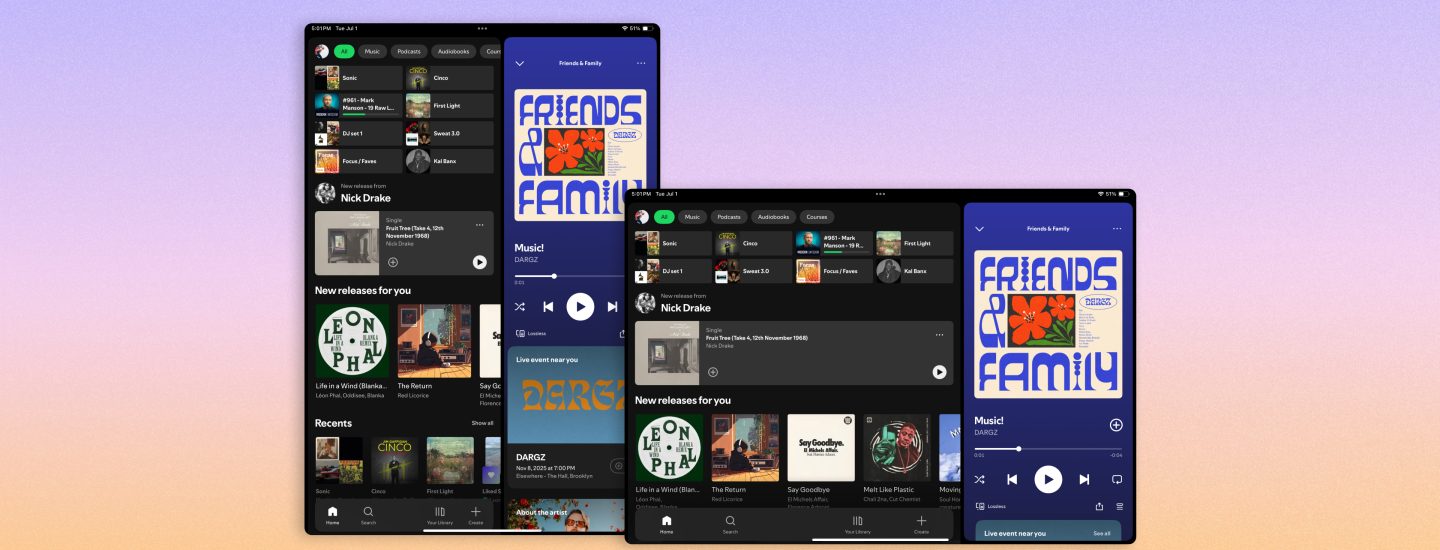
Spotify hasn’t just stretched its mobile app to fit a bigger screen, it’s rethought how the interface behaves entirely.
A layout that adapts as you move
Switching between portrait and landscape now feels far more natural. Instead of simply resizing, the interface reconfigures to suit how the device is being held.
A smarter, collapsible sidebar
A new sidebar brings browsing next to your playback, which can be hidden or expanded. That means users can discover their next listen, all without interrupting what’s currently playing.
Video takes center stage
Spotify is continuing its push into video, by leveling up the experience on tablets. A more prominent “Switch to Video” option makes it quicker to jump into and immerse yourself in visual content.
Browse while you listening
Parallel browsing means you can keep your current track or video running on one side of the screen while exploring new music, podcasts, or audiobooks simultaneously.
Still familiar, just better
Despite the changes, Spotify wants it to feel consistent with the mobile app. Essentially, it’s a smoother, more expansion version of what they already know.
“From TV to desktop to the car, we’ve been designing Spotify to feel native to each screen- and now we’re bringing that same experience to tablets. Tablets give you more room to explore, so we designed it to let you browse and discover new favorites alongside what’s already playing. The goal was simple: Wherever you open Spotify, it should feel unmistakable like Spotify.”
Nicole Burrow, Head of Design, Consumer Experience at Spotify
What this means for artists
Updates like this matter for artists too as they shape how fans interact with streaming. With this redesign, Spotify is making it easier for listeners to discover new tracks while they’re listening. Features like parallel browsing make it easier for listeners to fall down a discovery rabbit hole, and that’s exactly where artists can benefit.
The takeaway? The more Spotify improves discovery and engagement, the more important it is to have your music properly distributed, and ready to be found. If you’re looking to get your track onto Spotify and beyond, RouteNote can help distribute your music to platforms worldwide.
Final thoughts
Spotify’s tablet refresh might seem like a small update on the surface, but it reflects how platforms are thinking more carefully about how their experience across different devices and user habits.
For those in the industry, it’s a reminder that user experience is never just about design. It directly impacts discovery, engagement, and ultimately growth.
Distribute your music to Spotify and other major platforms worldwide for free with RouteNote today!