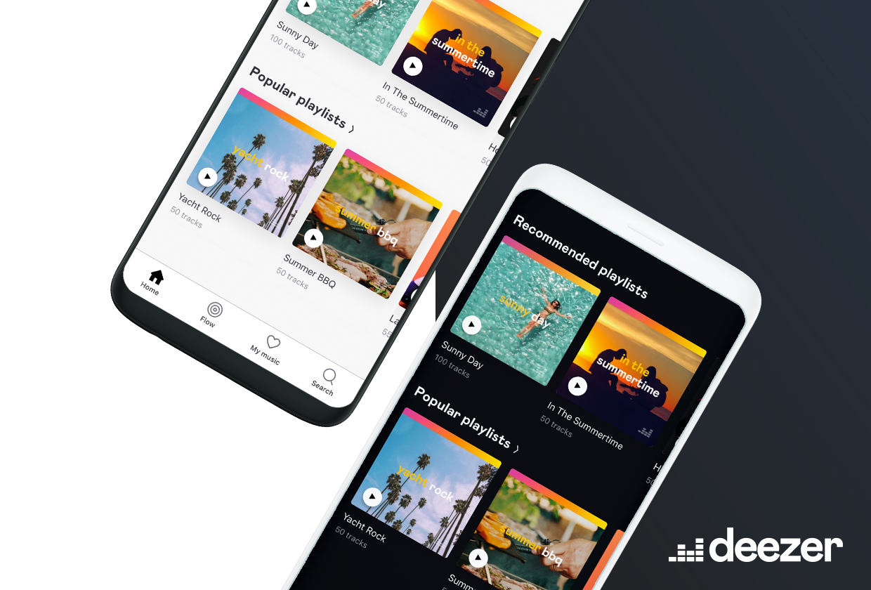
Deezer’s dark mode makes their new look even fresher
Deezer recently changed their look for a fresher, better music streaming experience and they’re taking that polish and making it dark.
Deezer’s recent re-brand re-invigorated their appearance in a way that they say “highlights the brand’s human and local identity”. It does have a good, smooth new look that makes streaming music on Deezer an even better experience.
The brand’s “human identity” may be coming through in an even newer addition, allowing listeners to customise their experience more. With a new dark mode rolling out users can choose whether the app has a bright and light look to it, or a darker black theme.
The new mode rolled out today to Android users and will be available for all Android users in a few days accordingly. It’s available for both Free and Premium users on Android devices and on the streaming service’s website.
Deezer’s Chief Product and Growth Officer, Stefan Tweraser said: “Dark mode is not only one of the most requested features from our users, but it’s also one that we are personally excited about. While we love our rebranded app, we also understand that in some situations, it would benefit users to switch between light and dark.
“So, whether you want to prevent eye strain or it’s just your preferred style, Deezer’s dark mode is for those who dare to venture to the dark side.”
