YouTube Music Now Playing redesign rolls out on mobile
YouTube Music has updated Now Playing on mobile with a dual-pane redesign, new controls, and improved queue navigation.
A redesign and shuffling of the Now Playing display from YouTube Music is certainly no strange thing. As 9to5Google reports, the company is now rolling out a redesign of its Now Playing screen on Android and iOS. After testing since November last year, the new look is arriving more widely and makes a number of noticeable changes to how controls and features appear. This update brings a cleaner, more modern layout that aims to improve usability without removing familiar functions.
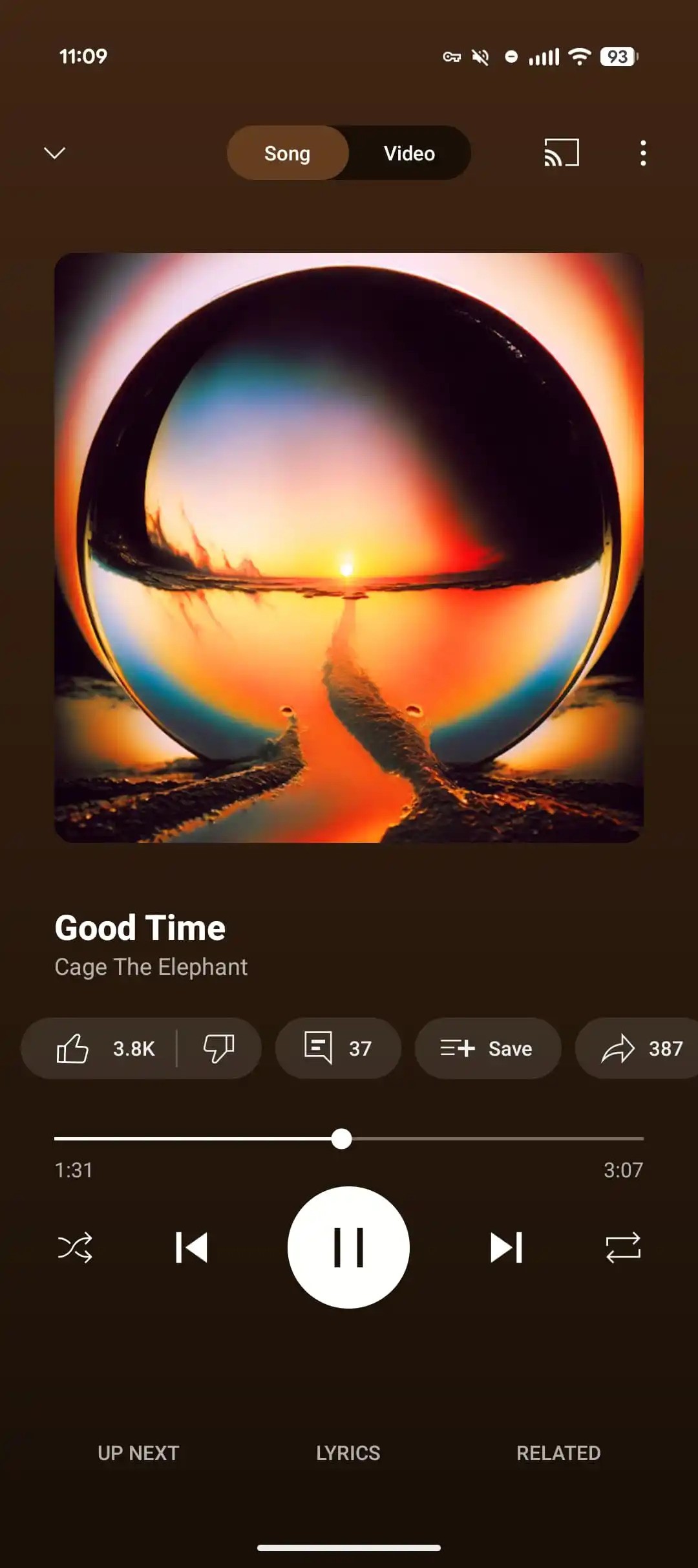
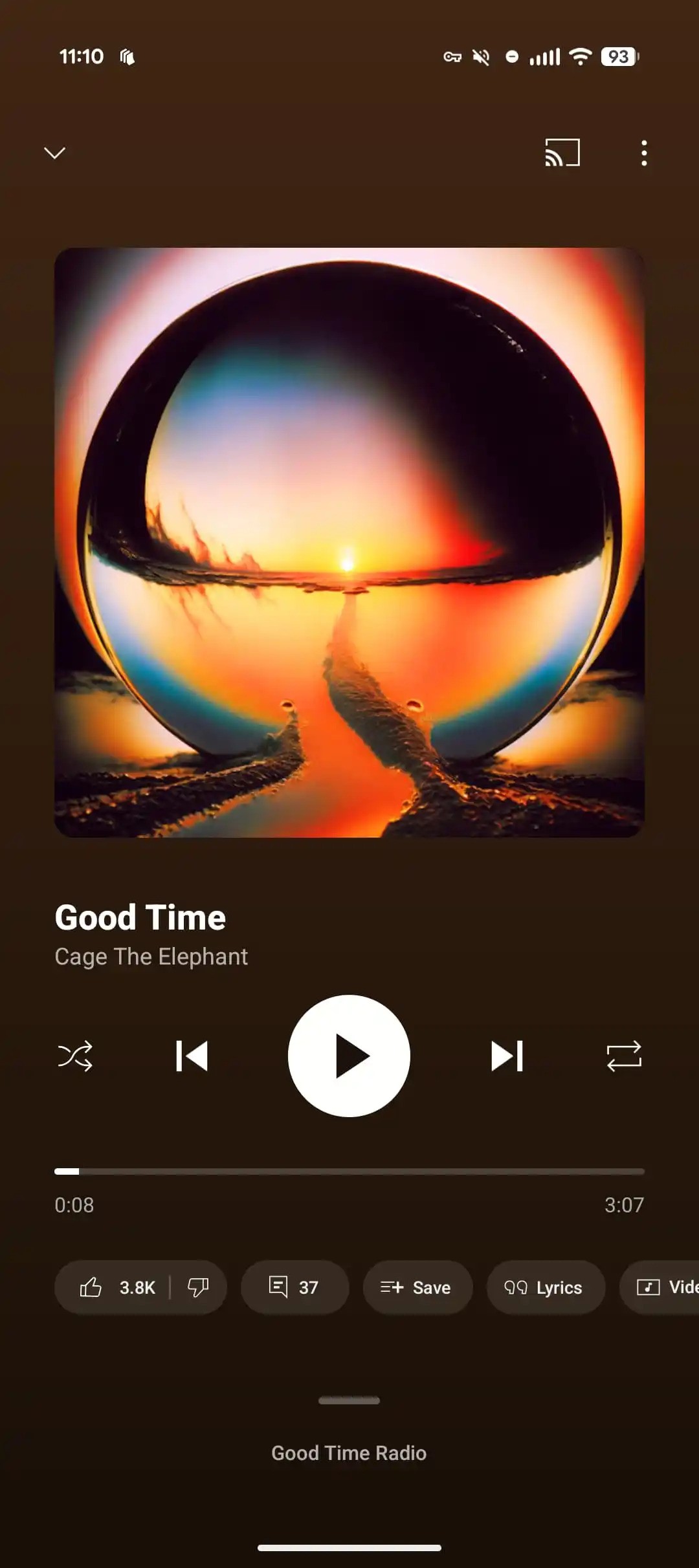
The Song/Video switcher, which used to sit at the top of Now Playing, has been shifted into a carousel of actions – something that was spotted back in June. Beneath the song title and artist name – which still doubles as a shortcut to related content – sits a row of playback controls.
The playback scrubber has also had a tweak. Now, instead of a thin line with a round playhead, users will now see an ever so slightly thicker bar (but still neatly thin) that becomes bolder when dragged along. This simple change contributes to the uncluttered look.


Other buttons, like the engagement icons – comments, Save and Lyrics – have been grouped into a carousel beneath the playback bar. Again, this move can be traced back to June this year. However, the thumbs up/down icon has now been grouped into the carousel as well, and is no longer sat beside the track title and artist name. Another move clearly in the name of tidying up. Here, users will also find the Share, Download and Radio options.
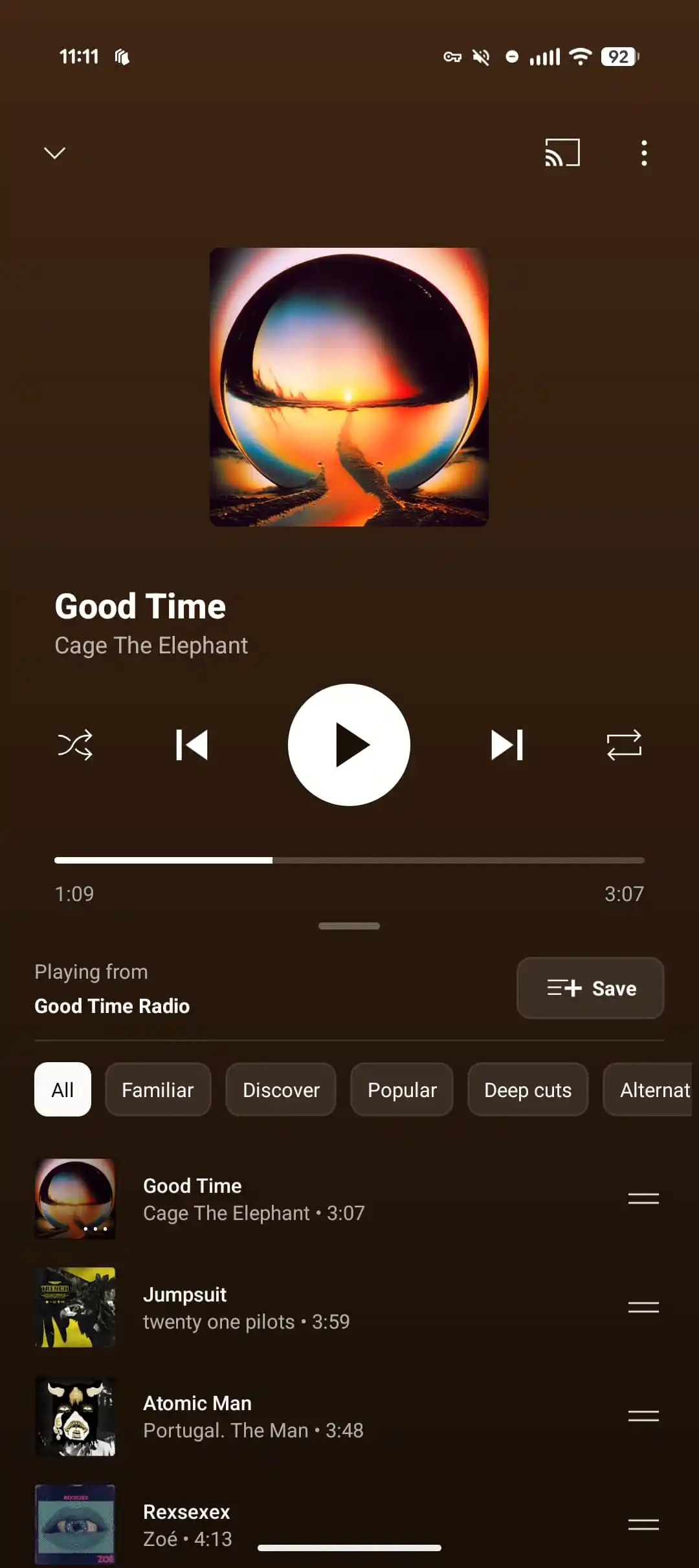
A bigger shift comes with the new “Up Next” section. There’s now a drag handle that can be tapped or pulled up to reveal what playlist or radio you are on. Once opened, a new dual-pane view appears, showing several upcoming tracks in your queue with the option to expand further. The carousel of icons disappears here, giving more space to focus on the music ahead.

The Related and Lyrics sections have been given a cleaner, more modern look. They can now be expanded to full screen, while the default view still shows the currently playing track with easy access to play and pause buttons at the top. The previous colour-themed design has been removed, giving the panels a simpler, more streamlined appearance. Podcasts now follow the same design, creating a consistent experience across content on YouTube Music.
For those looking for the redesign, as 9to5Google notes, “If you’re not seeing it yet, Force stop from App info or remove from the multitasking menu.”
